AUTONEWS

Edmunds tests Android Auto and Apple CarPlay updates
The fall season coincides with the reveal of the latest smartphones and operating systems from Apple and Google. This year in particular marks the first time that the two brands have significantly overhauled their automotive software—Apple CarPlay and Android Auto—to make them easier to use. Edmunds gives an overview of how these systems work and which new features our experts like the best.
HOW DOES IT WORK?
Android Auto and Apple CarPlay allow you to connect your phone to a vehicle and utilize many of your phone's apps, such as map navigation, text messaging and online music streaming. There are two main requirements if you want to use these systems: a vehicle that supports Apple CarPlay or Android Auto and a phone with recent firmware.
Android Auto requires that you download a special Android Auto app before you can make it work; Apple CarPlay is integrated into the iPhone operating system itself. Once plugged in via USB, the software automatically handles the Bluetooth pairing process. The Apple or Android interface will either come up automatically or after a button press, depending on the vehicle.
Both systems adapt to the vehicle's infotainment interface, such as a touchscreen or knob-like controller, and allow the user to initiate voice commands with a long press of a button on the steering wheel or on the screen itself.
WHAT EDMUNDS LIKES ABOUT THE NEW APPLE CARPLAY
The changes to Apple CarPlay take effect with the recent iOS 13 update. Users are greeted with a new home screen that has a multi-window view of the map, navigation shortcuts, pause and skip buttons for whatever music is playing and a preview of an upcoming calendar event.
Your enjoyment of the new home screen will be dependent on how often you use Apple Maps, which was also updated in iOS 13. If you're a regular user, you'll find it handy to navigate and have music controls on the same screen. But if you prefer Google Maps or Waze, you won't get the same experience with this new screen. These third-party navigation apps still work with CarPlay but will not display on the new dashboard screen.
A new day and night mode changes the background either white or black. We found the day mode to be a little too bright and distracting while driving. Fortunately, we had the option to keep the setting in night mode.
A few of the vehicles we tested had wider screens, which Apple now takes advantage of in CarPlay. We liked how this setup makes album artwork, media player and nav icons a little larger.
Finally, CarPlay will now let the phone multitask. Say, for example, you have Apple Maps running on the vehicle's screen, but your passenger wants to search for a song on Spotify using the phone. You can now do so without taking away the maps. Previously, CarPlay would mirror whichever app was running on the phone.

This undated photo provided by Edmunds shows the 2019 version of Apple CarPlay, which has a new dashboard home screen. Android Auto and Apple CarPlay allow you to connect your phone to a vehicle and utilize many of your phone's apps, such as map navigation, text messaging and online music streaming. (Scott Jacobs/Edmunds via AP)
WHAT EDMUNDS LIKES ABOUT THE NEW ANDROID AUTO
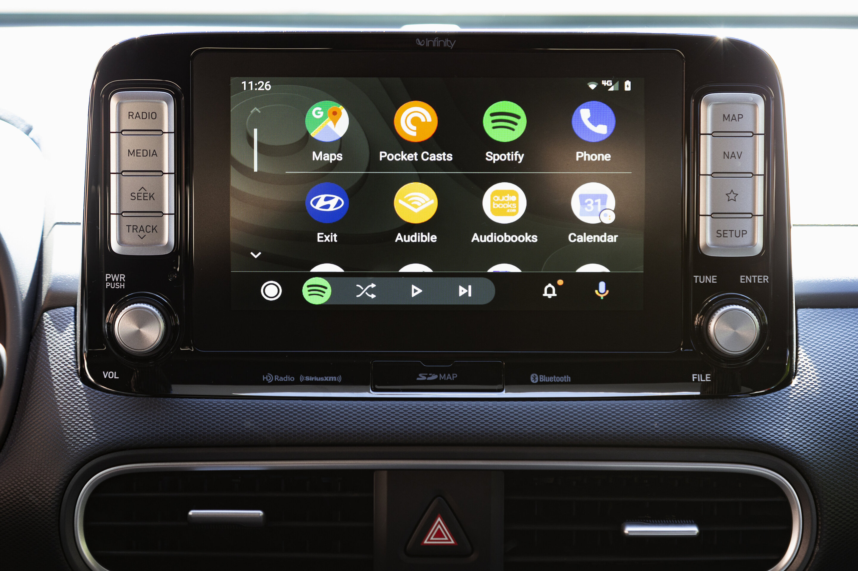
Google completely changed Android Auto's user interface for 2019. The old home screen is gone in favor of whichever navigation app you set as a default. Edmunds' test experts were split on this one. Some missed that the weather, upcoming appointments and suggested destinations were now all spread across different apps, while others liked how much quicker you could begin using navigation.
Tapping the circle-shaped app launcher button brings up a menu of all the supported apps you have access to. We liked that the most commonly used apps appear in the top row, making it easier than before to switch between your favorites.
We found the new app drawer to be one of the more useful updates to this year's update. This shortcut alternates between your map, music and phone apps and will contextually display the last app you used. For example, if you're on the map and listening to Spotify, the music controls will be on the bottom menu. Alternately, if the music player is on the primary screen and you are navigating, the upcoming turn directions will display in the drawer.
Android Auto also has a widescreen mode, which moves the app drawer and icons to a vertical orientation on the left and makes the time and navigation directions a little more prominent. Finally, the new notification menu is where missed calls, texts and alerts are consolidated. All texts are replied to via voice and the Google Assistant.
EDMUNDS SAYS: There isn't really a decision to make between these systems unless you're debating a switch from Apple or Android. The beauty of these systems is that they work with the phone you currently own. The only thing to keep an eye out for is whether the vehicle you're interested in supports it.
by Ronald Montoya

Nenhum comentário:
Postar um comentário